
Brand | Independent | 2024
I was approached in early 2024 to help create a brand identity for Ezili Farm, a place of respite and recovery for Black youth & adults in Philadelphia. Using green space as a place for stewardship & creativity, Ezili Farm serves as a third place for people who are interested in reclaiming land, using the land for nourishment, and using education to build on creative projects.
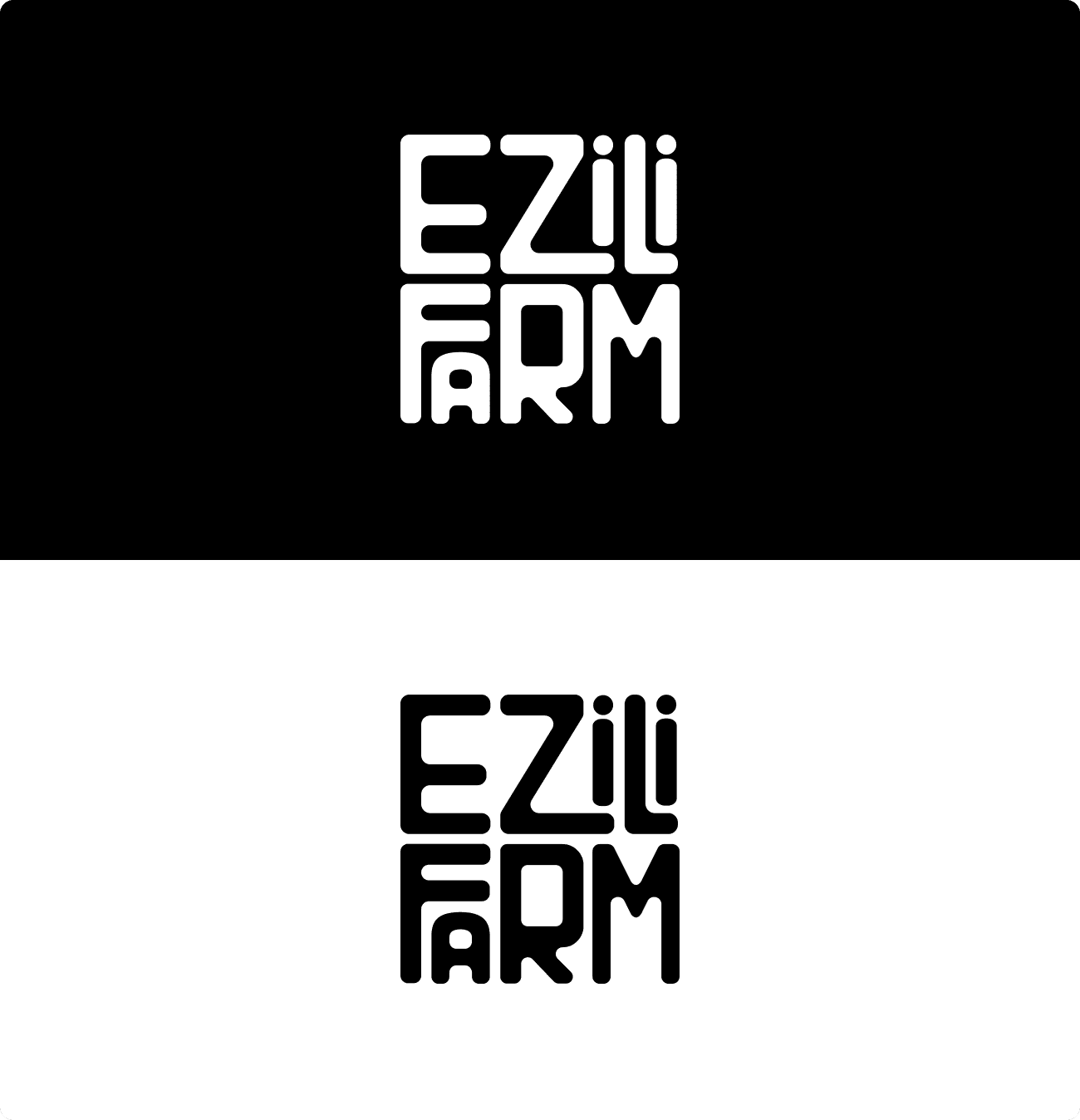
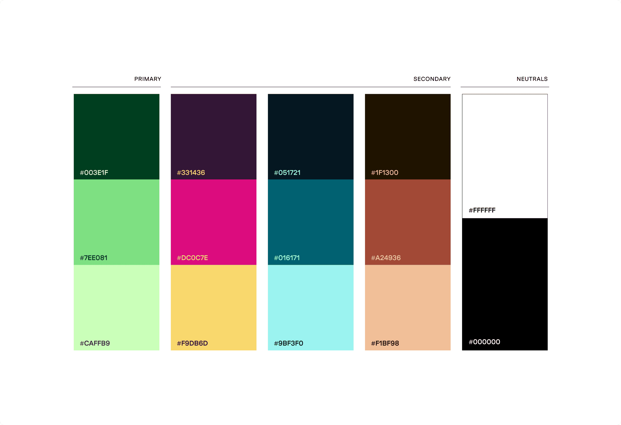
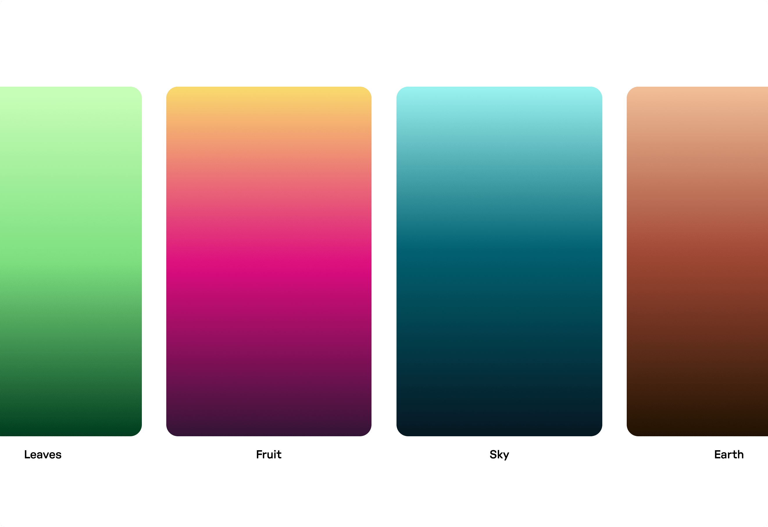
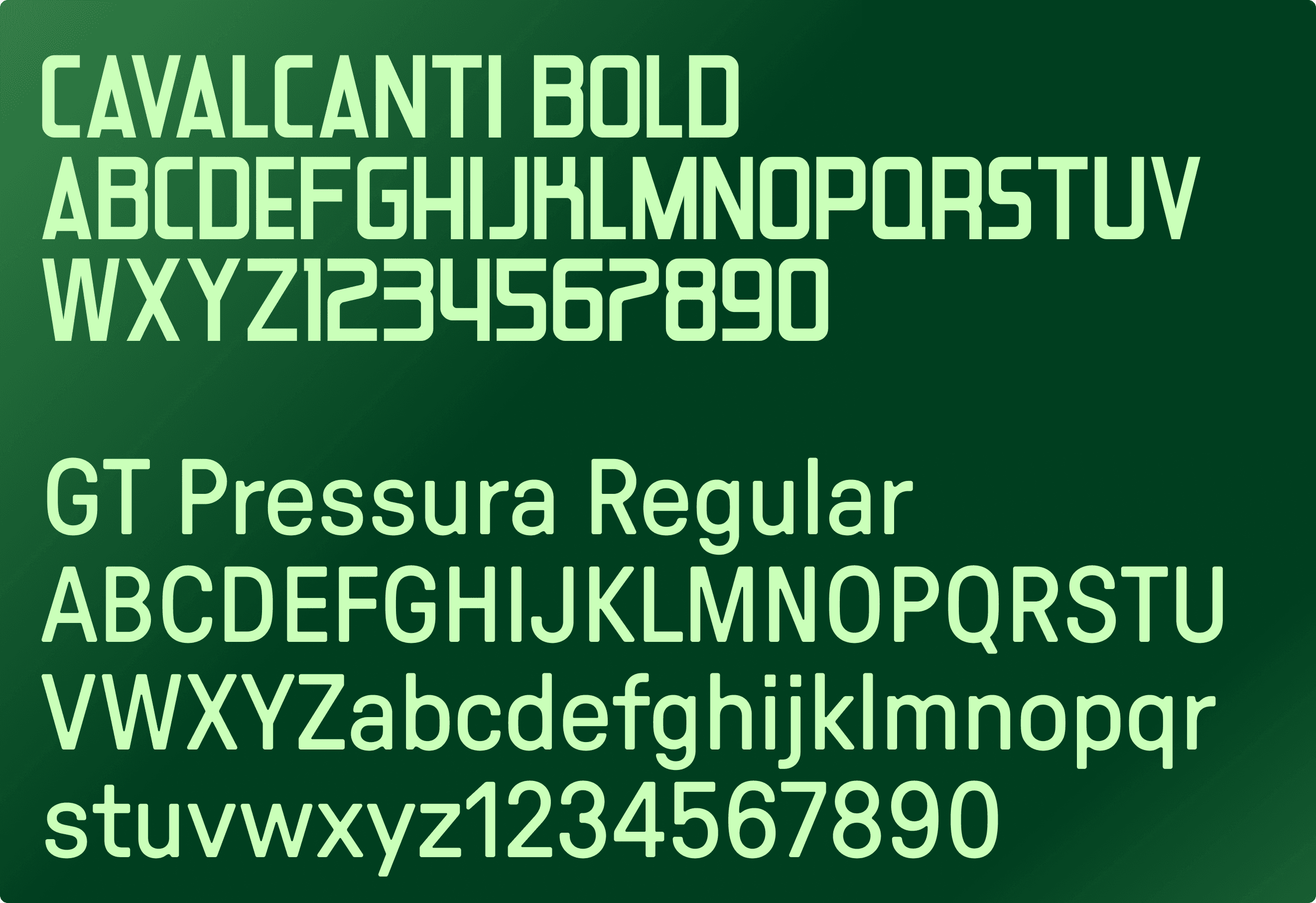
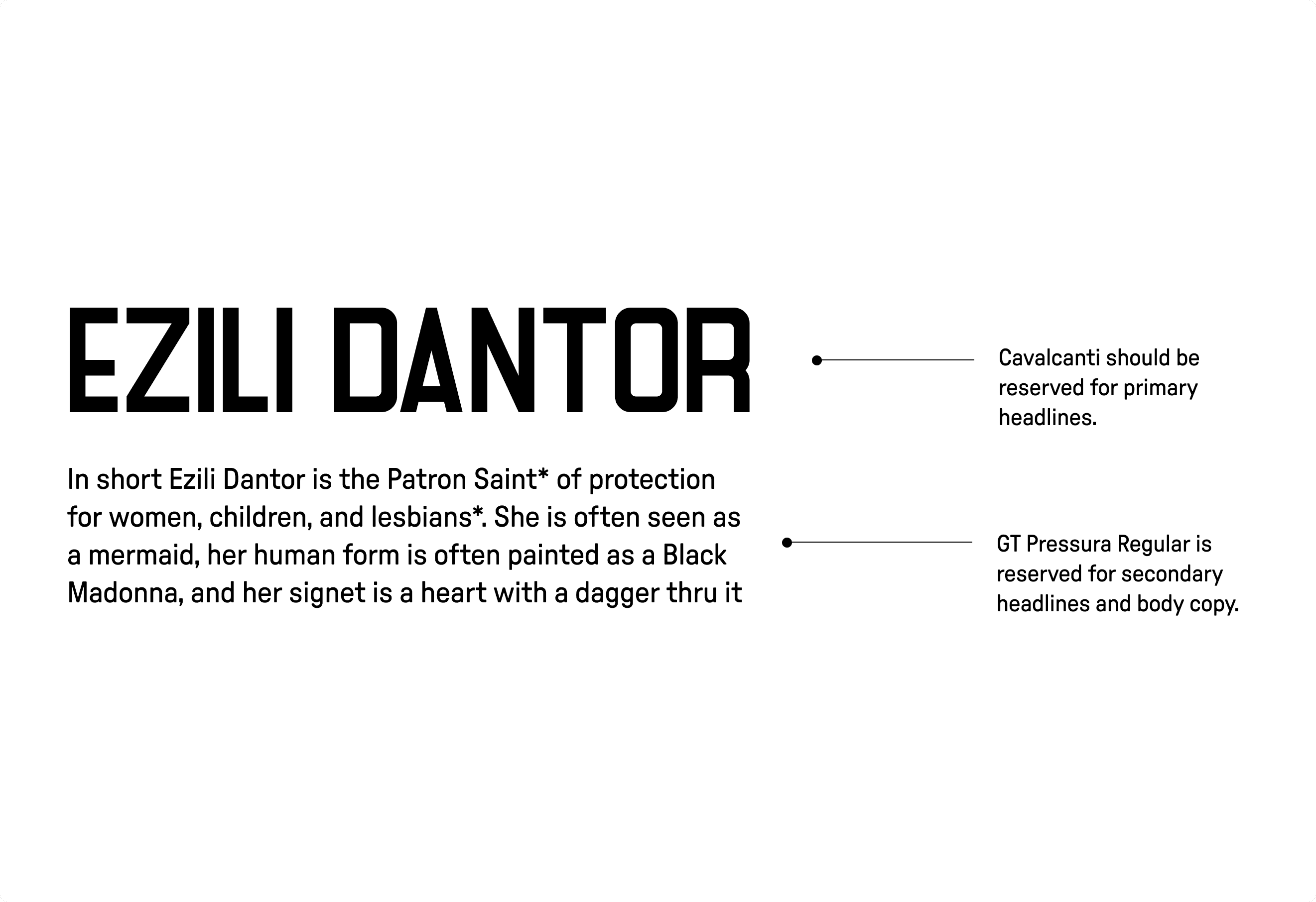
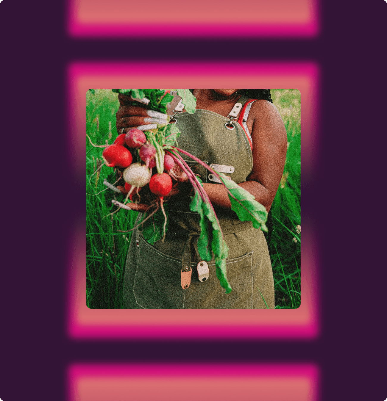
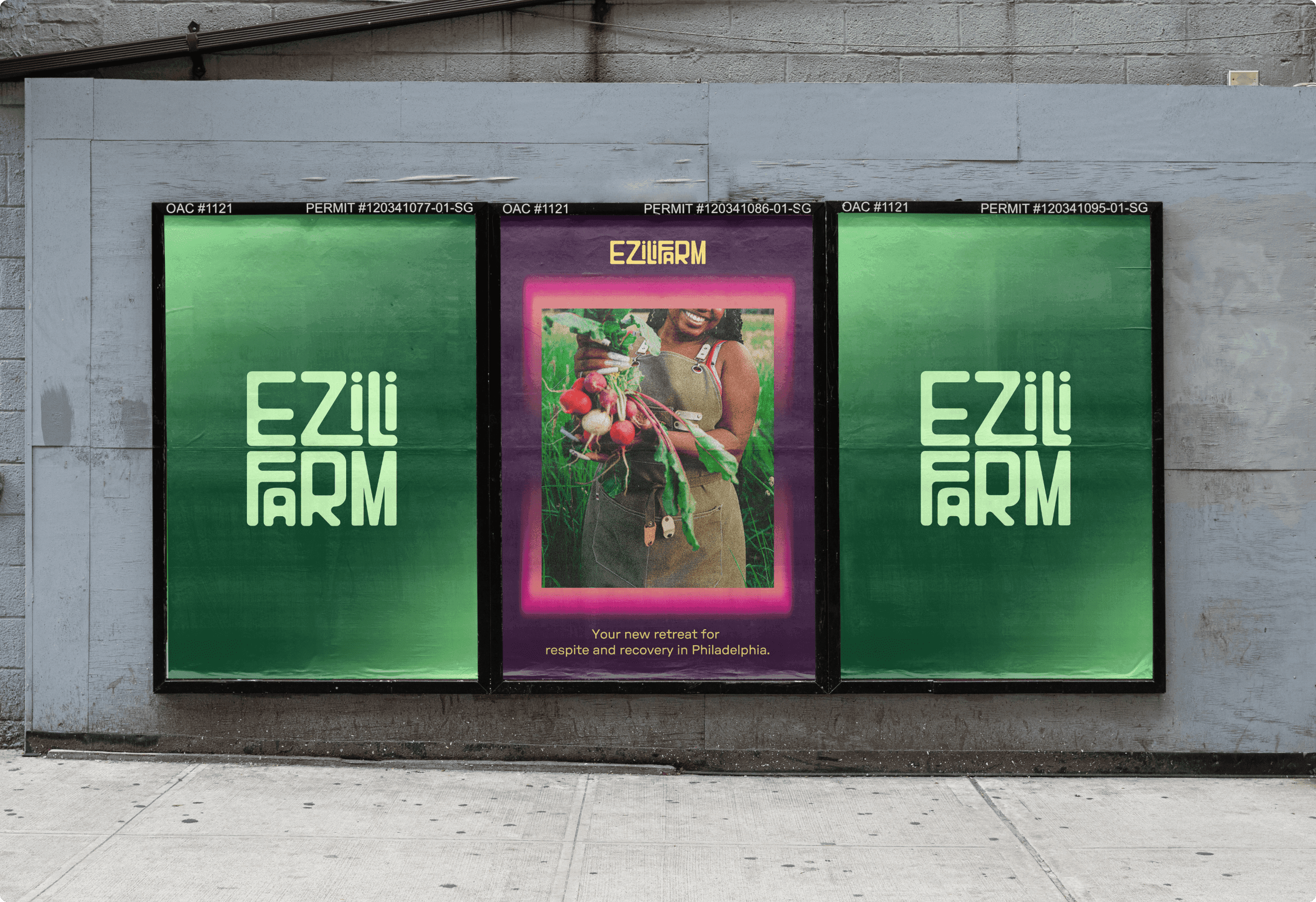
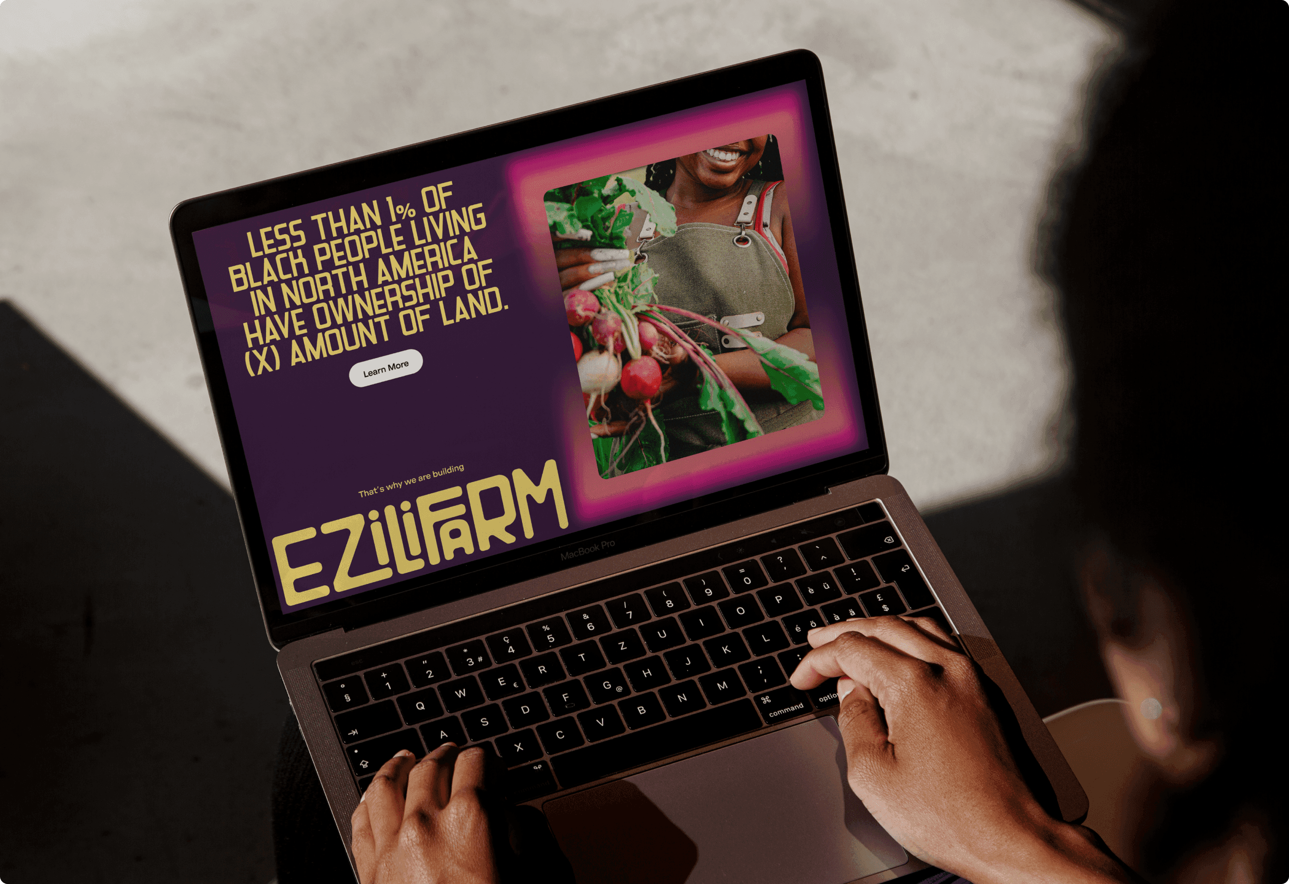
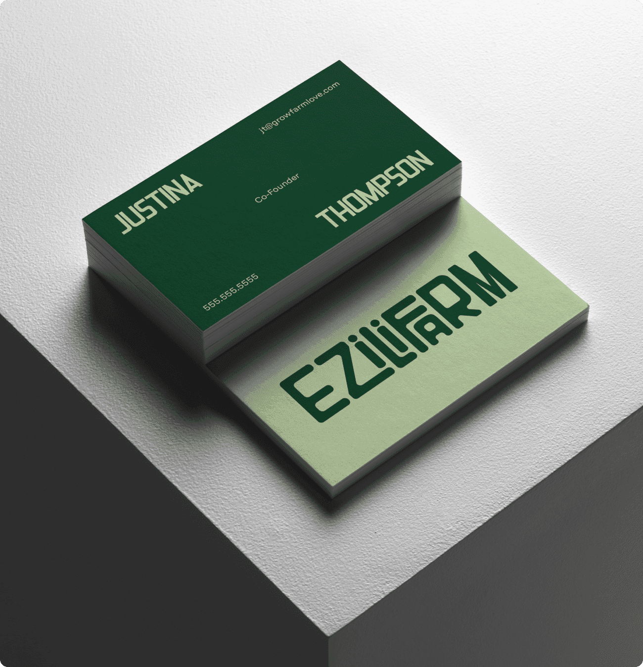
Using the inspiration from leaves, fruit, sky and the Earth, I was able to work with Ezili Farm to create a logo & brand system that they could use in tons of different formats. The logo is set in Cavalcanti by Tenbury Type and modified to create a wordmark that was soft but radical. The elements play a crucial role in the color palette and imagery and helps to create a balance in the brand. The leaves inspire the greens, while fruit adds a pop of color. The sky introduces the blue, while the earth grounds the palette with neutrals. All of the imagery fit in with a set in the color palette and the use of gradients help create a soft frame around the different imagery.
