
Brand | Independent | 2024
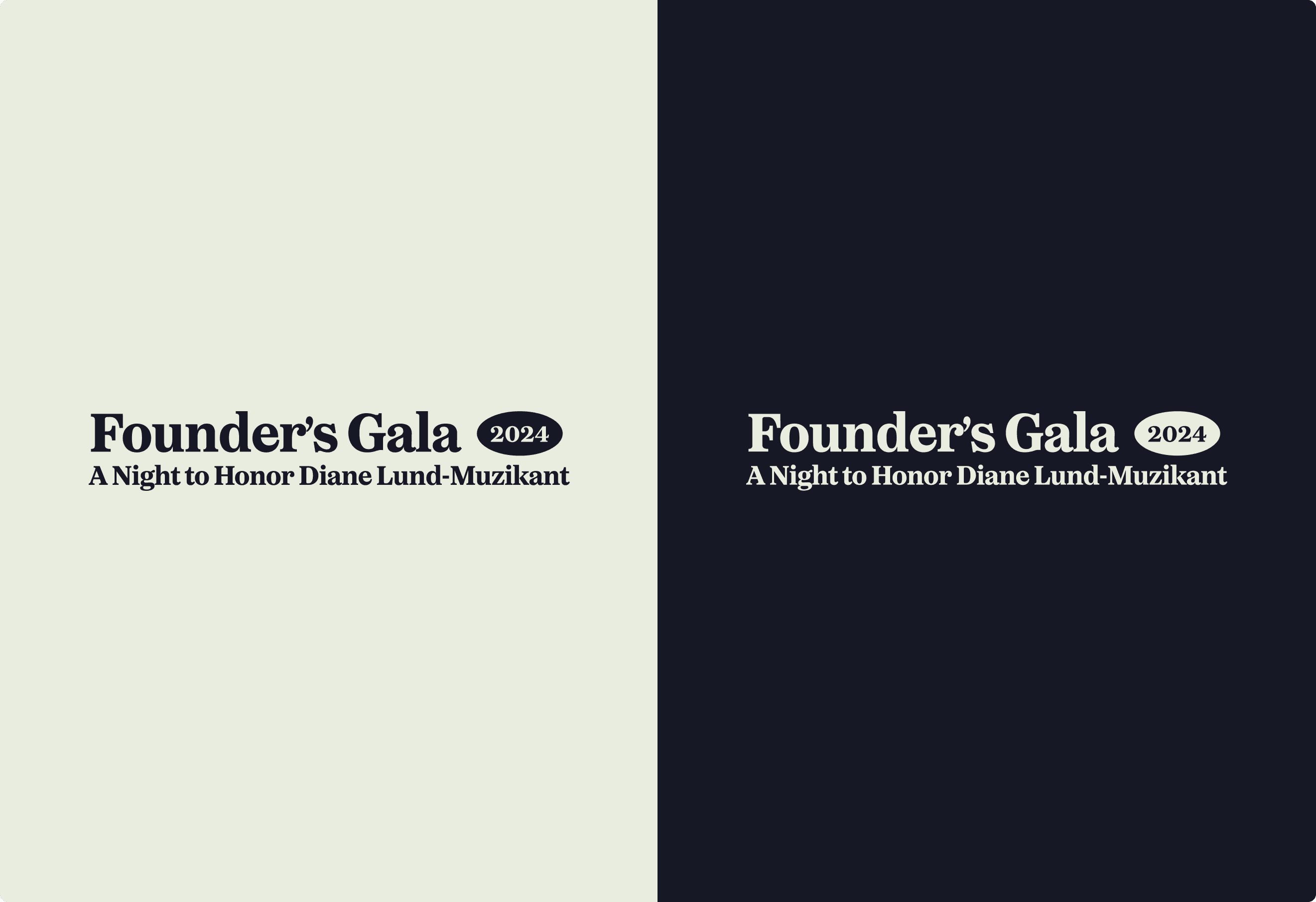
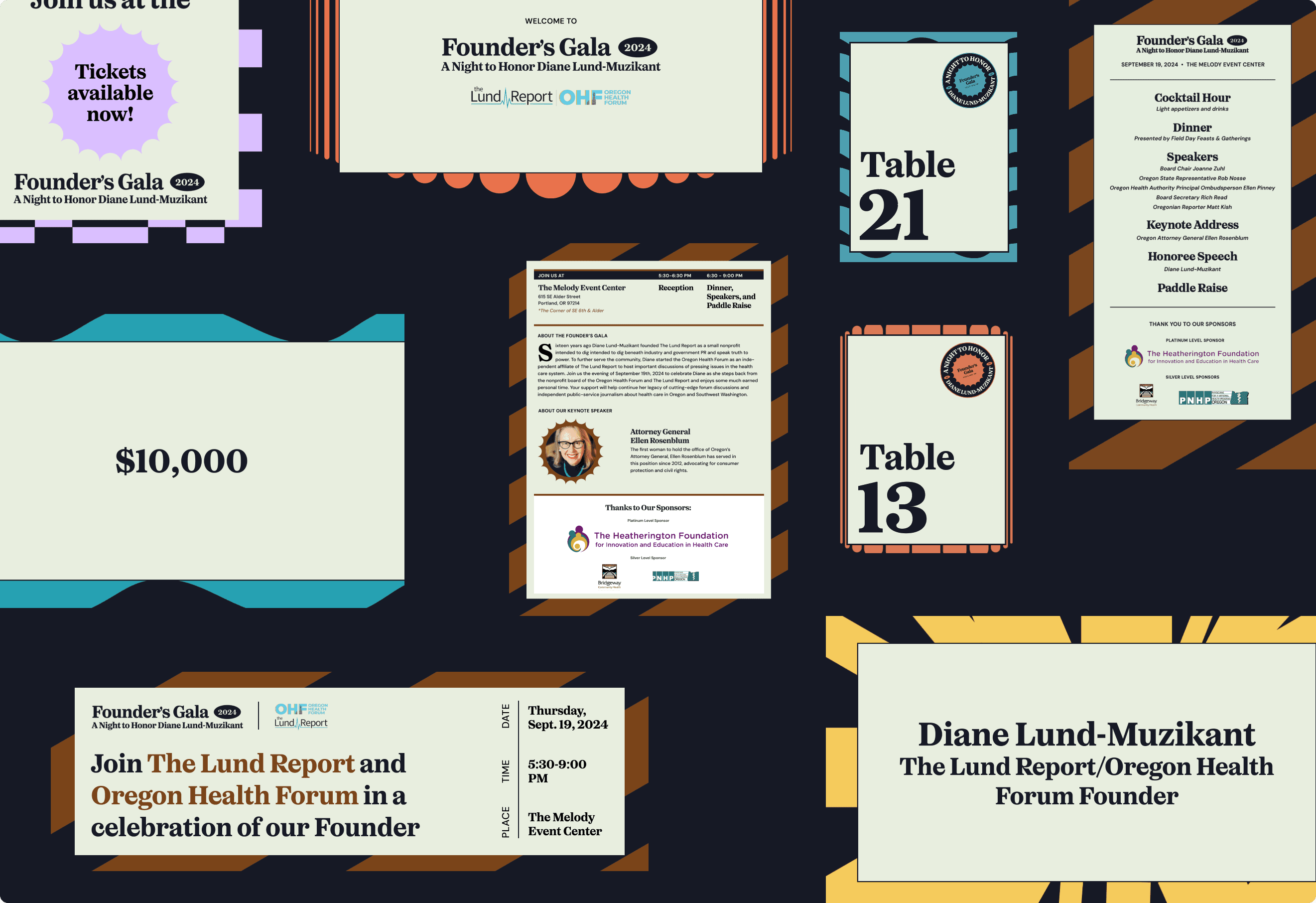
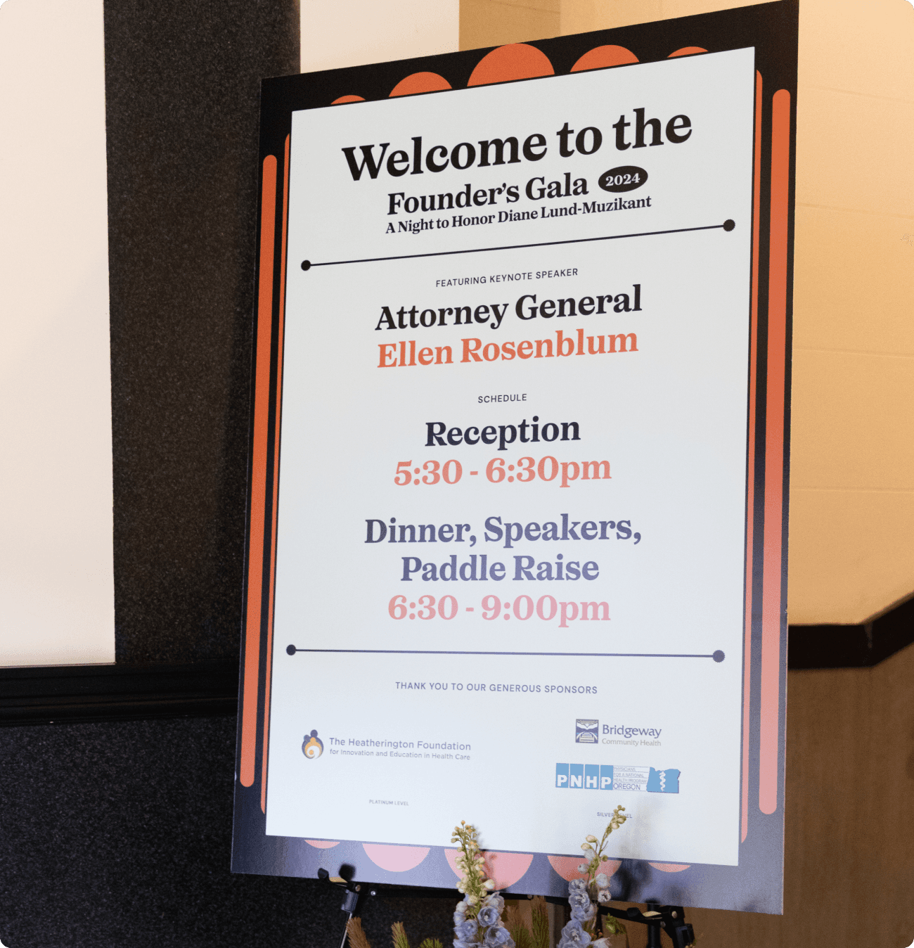
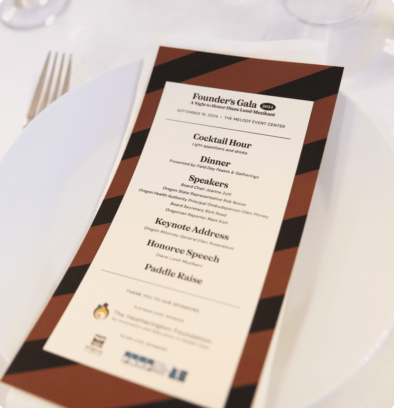
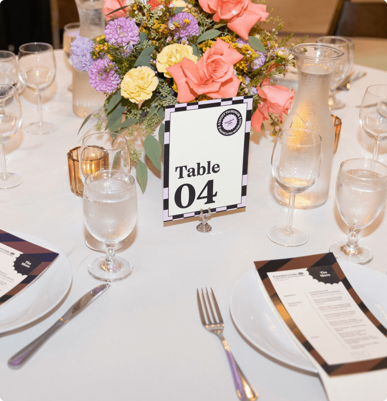
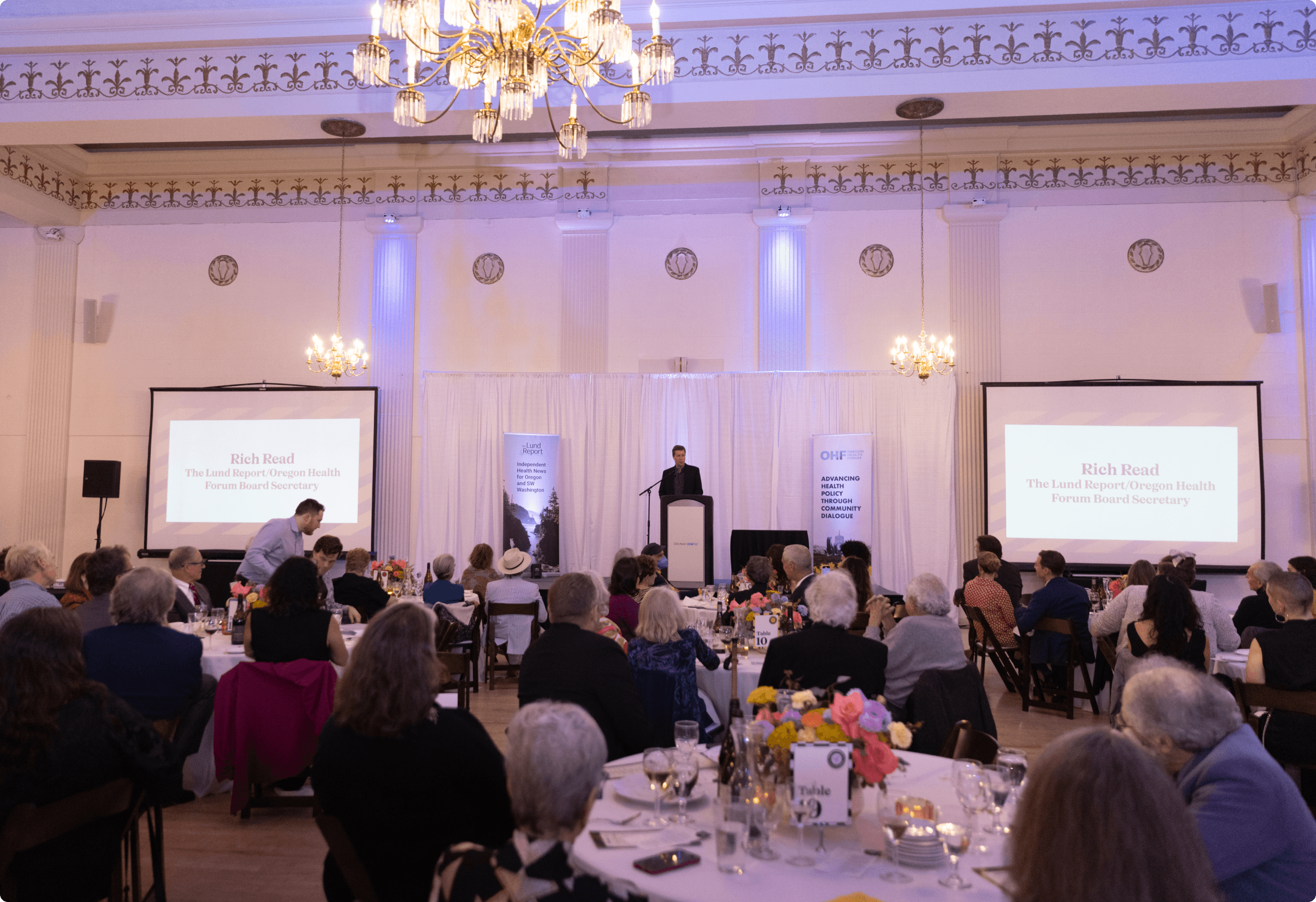
For this special September fundraiser, I was tasked with creating a branding system that would honor the organization's founder, Diane Lund, Muzikant. The design needed to strike a balance between being eye-catching and inviting, while remaining simple and easy to implement across various formats, both digital and print. The goal was to develop a cohesive visual identity that would work seamlessly for invitations, signage, & digital promotions—all while maintaining a straightforward and elegant approach to ensure clarity. The design aimed to reflect the significance of the occasion, engage guests, and support the fundraising efforts without overwhelming the core message of honoring Diane and the organization's milestones.
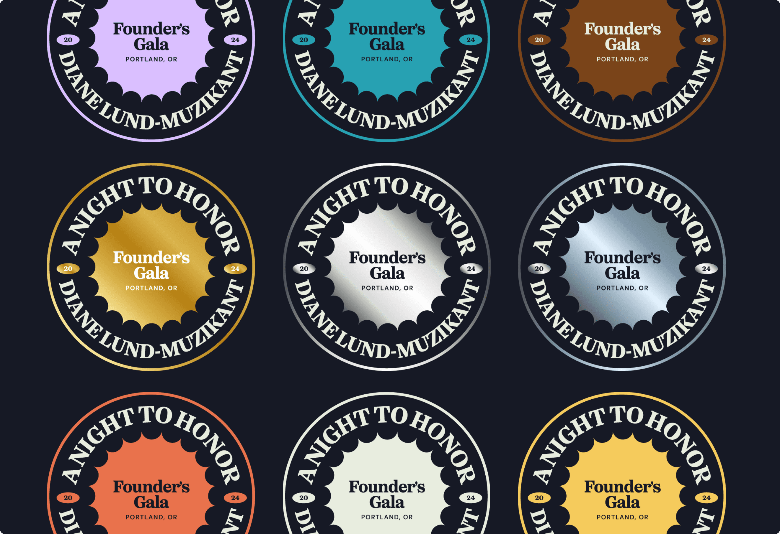
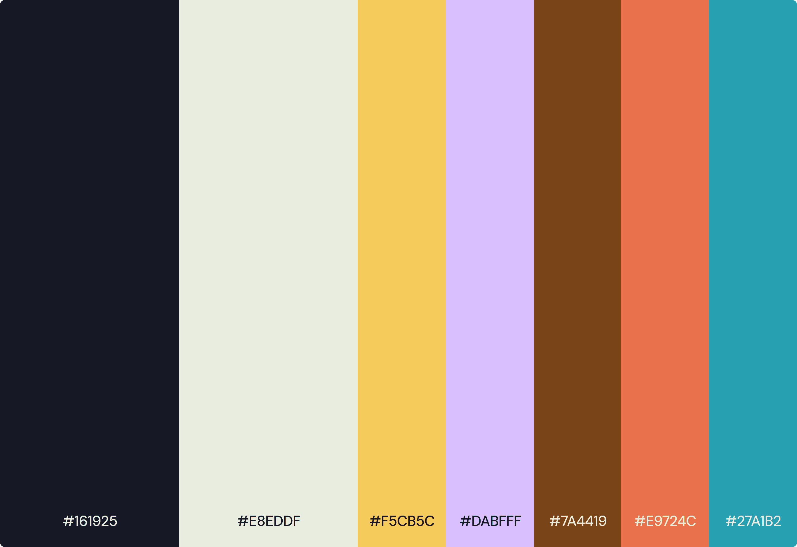
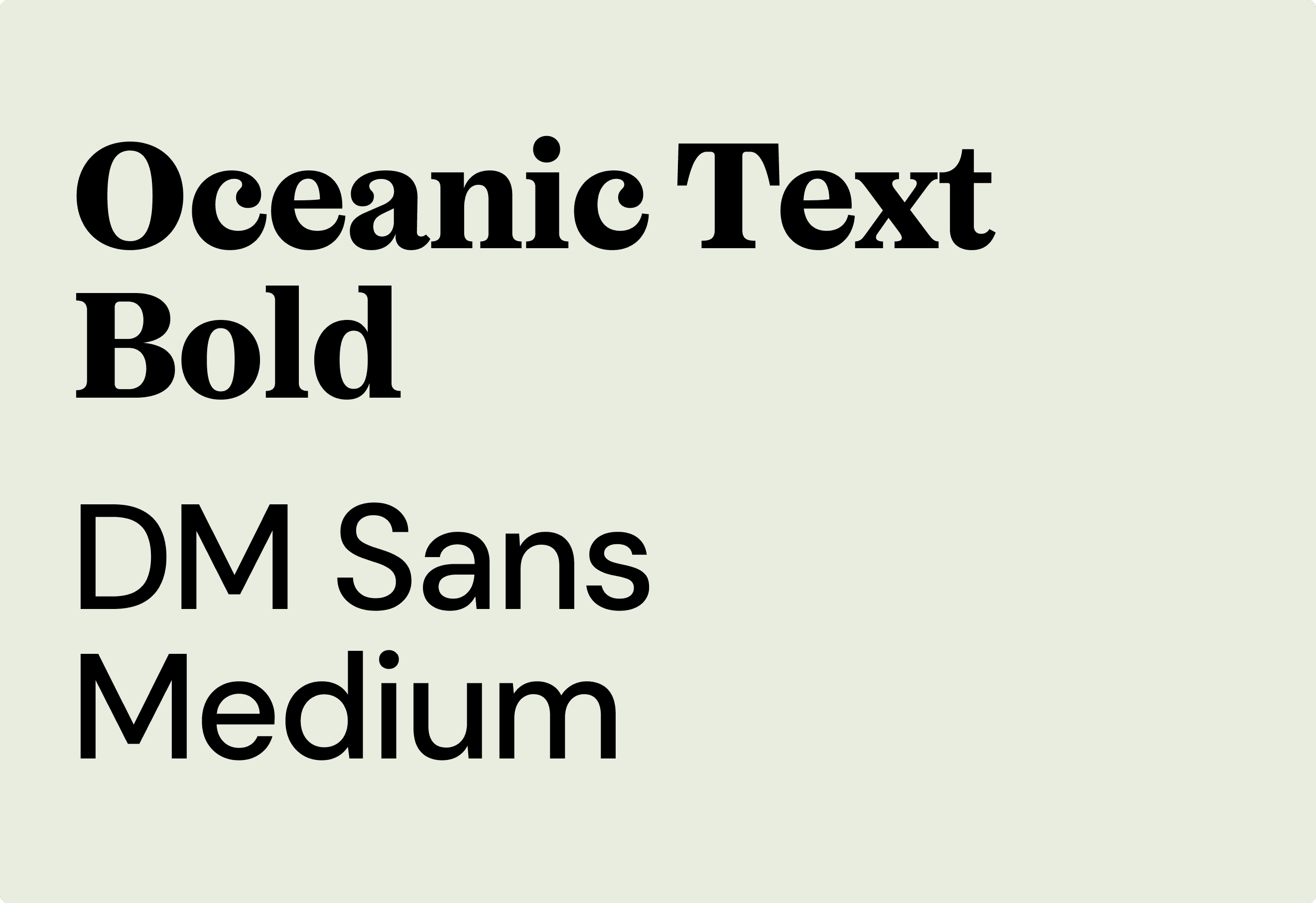
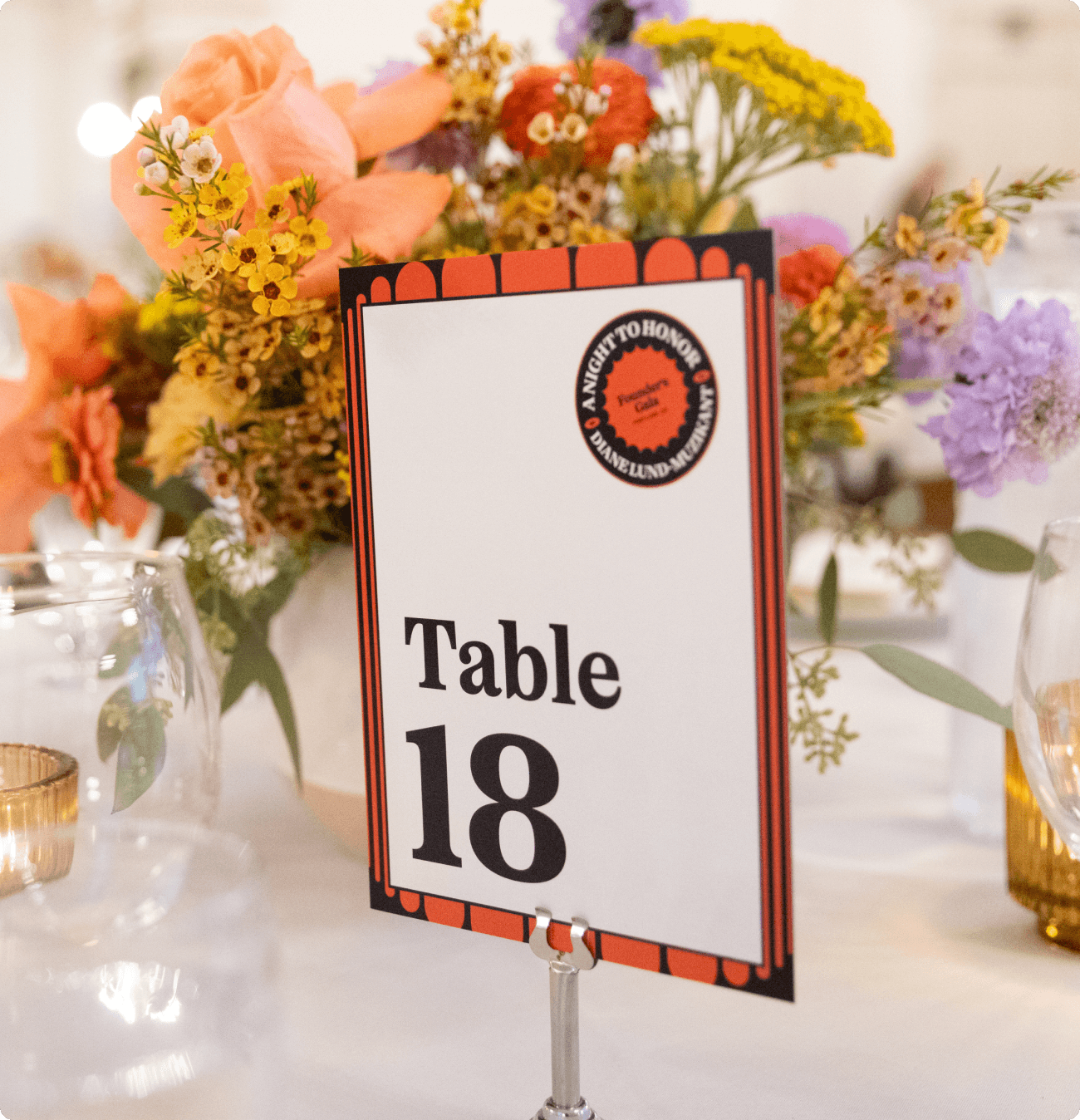
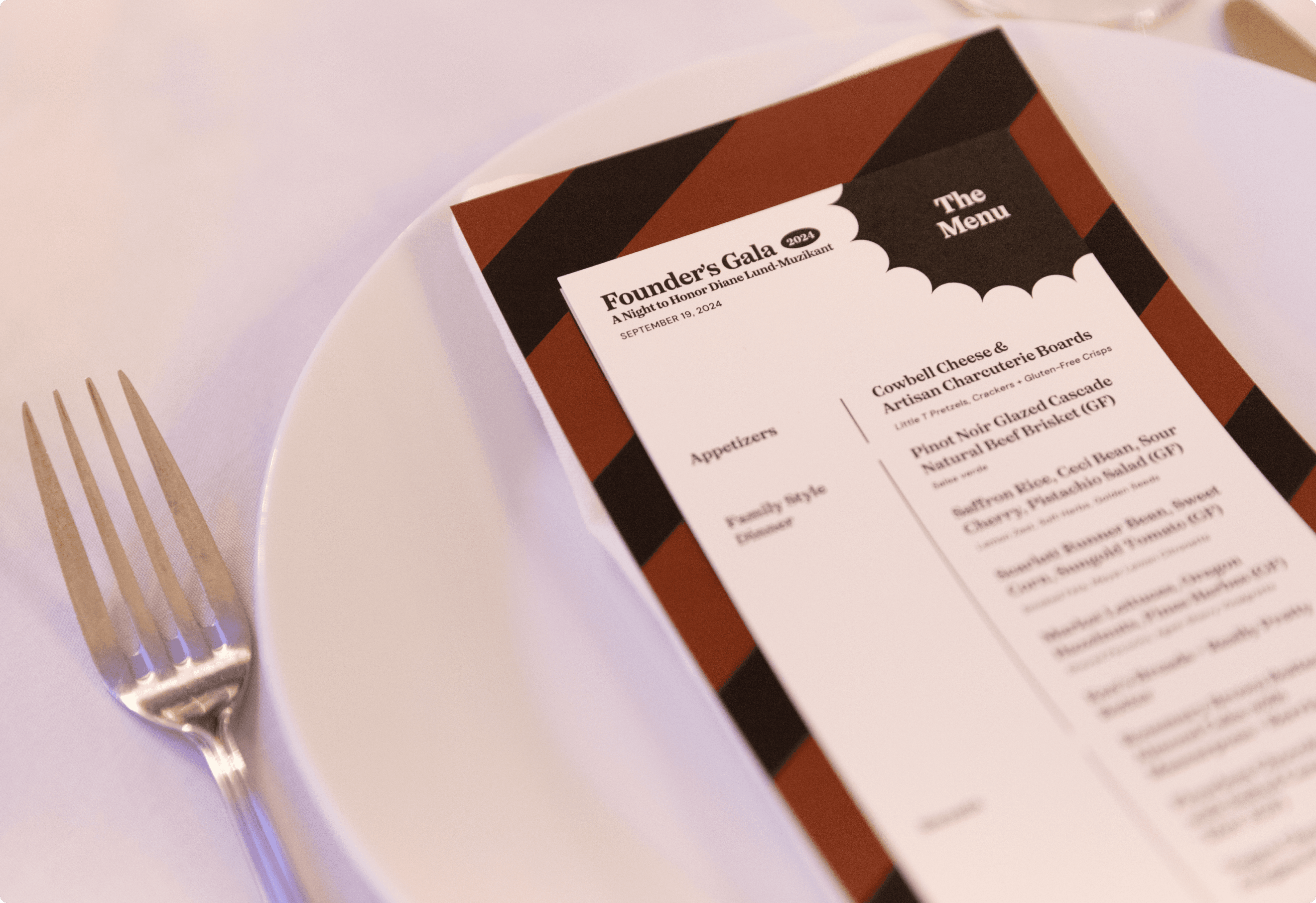
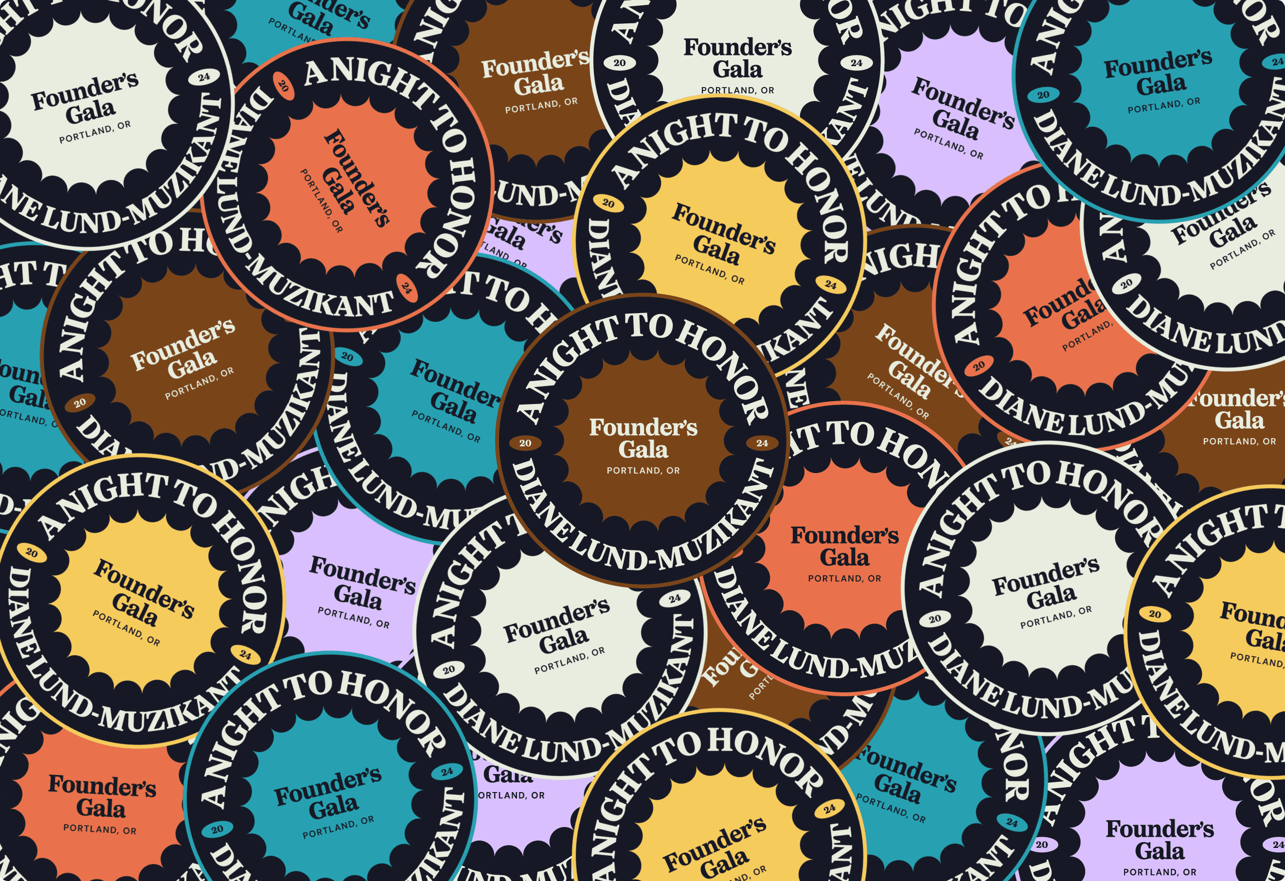
I placed a strong emphasis on typography and patterns, making them the centerpiece of the design. I chose Oceanic Text, a sophisticated serif typeface, as the primary font, leveraging its bold weight to create a striking visual presence. Given the elegance of the event, we selected a deep navy blue as the foundation color, evoking a sense of refinement and class. The remaining colors in the palette were thoughtfully incorporated as accent elements, carefully tailored to complement the overall aesthetic. To further elevate the brand’s emotional impact, I crafted a series of bespoke patterns, each designed to evoke a unique feeling—whether bold and dynamic or moody and refined—ensuring that the visual identity resonated with a range of emotions while maintaining a cohesive, luxurious atmosphere.
